
When the website and logo for CNarts was first designed a number of people asked why yellow was used as the main colour. The explanation I gave at the time was for a few reasons; one because it is a very contemporary colour for graphics. Another was that it compliments and doesn’t clash with a number of other arts organisations and online territories that we may well be seen alongside, such as Artweeks, Twitter, Facebook, The Literary Festival, Chipping Norton Theatre etc. And also, yellow is, well, bright and positive.
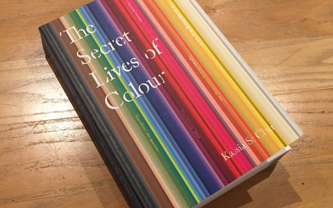
This Christmas I was given a very interesting book by a friend. Fascinating info about the historic significance of pretty much every colour you can imagine. So I looked up yellow. Below is an (edited) extract…
Chrome Yellow:
The baking late summer of 1888 was the happiest time of Vincent Van Goh’s life. He was in the ‘Yellow House’ eagerly awaiting the arrival of his hero, Paul Gauguin. Van Gogh hoped that together they would found an artists’ commune. He began working on a series of sunflower paintings, with which he planned to cover his whole studio.
Whilst avant-garde artists of the day had access to woderfully saturated reds and blues, they were lacking an equivalent of the third primary: yellow. Chrome yellow arrived none too soon and Van Gogh was one of many to fall for it.
A French chemist Nicolas Louis Vauquelin began working on ‘crocite’ and soon discovered that the orange stone contained a new element which he named chrome or chromium, after the Greek word meaning ‘colour’
Cool, eh
Andrew Wildman
The Secret Lives of Colour is a fantastic book , a must for artists. Wrtuuen by Kassia St Clair